Color has a remarkable ability to shape the way we feel and perceive our surroundings. The hues we choose for our homes are more than just a matter of aesthetics. They can significantly impact our moods and overall well-being.
Start by adding some small accents like dining chair covers and witness the magic of colors with instant changes. In this guide, we’ll delve into the psychology of shades, offer tips on selecting the perfect color palette, explore current home color trends, and provide practical advice for successful implementation.
Psychology of Color
Colors proved to have a profound effect on our emotions. Warm hues of red, orange, and yellow can evoke energy and passion. It makes them suitable for spaces where social interaction is desired, such as dining rooms or living rooms.
On the other hand, cool colors like blue, purple, and green have a calming and soothing effect on our mentality. They promote relaxation and can help reduce stress and anxiety. As a result, these dyes are often chosen for spaces like bedrooms or home offices, where they contribute to a peaceful and serene atmosphere.
Understanding the emotional impact of colors allows you to choose the right shades for each room in your home, creating an environment that suits your specific goals and the activities that occur in each space.
Selecting the Perfect Color Palette
Choosing the right color palette for your home is a fun yet responsible process. Before settling on a scheme, it’s crucial to consider several key factors to ensure the colors resonate with your space and style.
- Room Size. The size of the room may affect the color choice. Lighter colors, such as soft blue or pale yellow, can make a small room feel more spacious and open. In contrast, deeper colors like rich green or warm red can create a sense of intimacy in larger rooms.
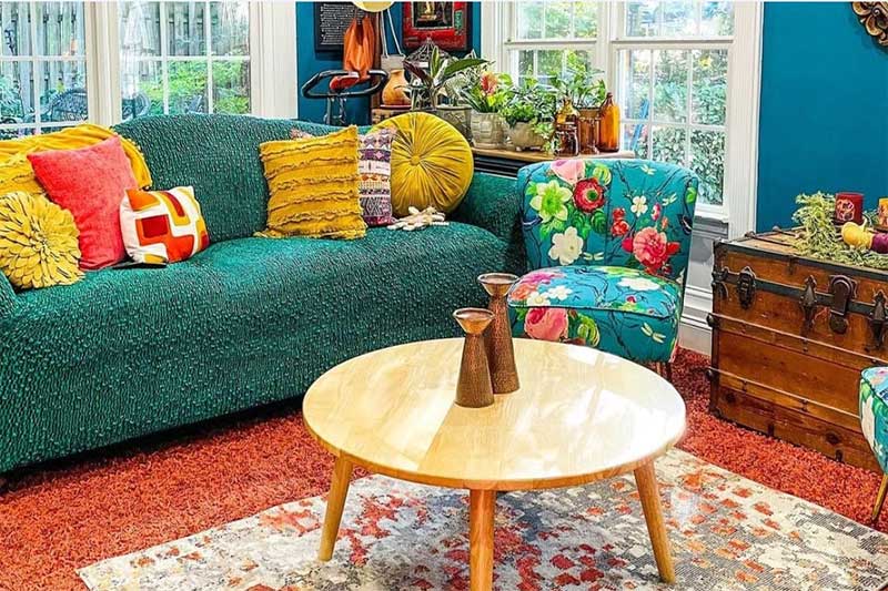
- Existing Furniture. Take into account your existing furniture and decor pieces. The color palette you choose should complement these elements too. If you have a statement piece of furniture, like a vibrant orange sofa, consider how your chosen wall and accent colors will harmonize with it.
- Natural Light. The amount and direction of natural light in a room can significantly impact how colors appear. In rooms with ample natural light, you can use a wider range of colors, including both light and dark shades. Consider how the color will look in different lighting conditions, from morning to evening.
- Architectural Features. Architectural elements such as trim, crown molding, or built-in shelving can be enhanced or minimized with the right color choices. For example, painting these elements with a contrasting color can make them pop, while mixing them with the wall color can create a cohesive look.
Popular Home Color Trends
Staying up to date with current color trends can be a valuable source of inspiration. In recent years, earthy tones have gained popularity to bring a sense of nature into a room. Scandinavian-inspired palettes with soft grays and whites also continue to be a timeless choice for minimalist aesthetics.
In the field of furniture covers, the prevailing color trends are closely related to broader interior design preferences. Earthy tones are all the rage at the moment, with muted greens, warm terracotta, and serene blues taking center stage. To embrace this trend, consider slipping your furniture into these soothing hues, whether it’s a sofa, chair, or cushion.
Meanwhile, timeless neutrals like soft grays and warm beiges continue to hold their appeal. They act as versatile canvases upon which various design styles can be painted. To channel this classic trend, choose neutral furniture covers on larger pieces and add a pop of color with bright accent pillows or cozy throws.
Finally, pastels are also having their moment, injecting playful charm with soft pinks, mint greens, and baby blues. These pastel tones can be applied to smaller furniture items or decorative pieces, adding a delightful touch of freshness. Furniture covers offer a convenient and reversible method for experimenting with these color trends, allowing you to stay stylishly up-to-date without a long-term commitment.
Intrusion in Conclusion
Incorporating your chosen color scheme effectively is the key to a harmonious living space. Beyond wall colors, consider using accent colors to infuse depth and interest into your environment through accessories like vibrant cushion slipcovers, elegant curtains, or captivating artwork. Your home should be a reflection of your individuality and preferences, so trust your instincts when making color decisions.
Remember, the impact of color in your home influences your daily life profoundly. By embracing the psychology of colors, making thoughtful palette selections, and staying attuned to current trends, you can craft a space that not only boasts stunning visuals but also cultivates comfort and inspiration!