Image source: unsplash.com (https://unsplash.com/photos/person-holding-brown-leather-wallet-and-banknotes-t-UV1rZqPuY)
For online gaming platforms, the first deposit is much more than just a transfer of funds. It’s the moment when a customer moves from curious to engaged. The player may have already completed the first account opening, registration, and browsing the game list. Hence, the deposit process becomes the final step that moves them to active user status.
This makes the payment process the key part of the whole customer cycle.
Simplicity, speed, payment option diversity, and clear incentives may decide whether users complete the deposit.
When these factors work together, the deposit feels like a natural part of the gameplay flow rather than a standalone transaction.
The Deposit is One of the Major Player Conversion Moments
The first transaction offer can greatly affect how quickly users decide to take on the challenge of a new platform. A casino welcome bonus is one example that can be highly motivating for users. Not only will the player feel they deposited twice as much with the initial deposit, but the first-time buyer also gets another reason to complete the payment; the main one, though, remains the bonus itself.
The payment itself then becomes part of the user’s perception of the welcome offer. A great incentive can draw the user in, while an intuitive deposit page converts that interest into action. Together, these two elements can give the potential player the impression that registering on the site is a breeze, rewarding, and easy to get used to right from the start.
To gaming platform developers, it means that the first deposit screen should be treated as carefully as the rest of the customer touchpoints, or even as the most important part of the entire user interaction.
Fastness Can Change the Whole Mood of the Payment Process
Our digital generation is used to being served payment services in no time. People order food, buy stuff, and join entertainment platforms all the time, expecting payment confirmation as quickly as food or a product.
The deposit process should match the spirit of the registration phase: it should be swift. If the user has decided to start playing at that point, make payment as frictionless as possible.
A few little steps may speed things up:
- Limited number of form fields that only ask for the information necessary for the payment;
- Remember payment methods on user accounts so that registered users can click a green button;
- A payment completion confirmation displayed to reassure the user;
- Deposit pages that load quickly, especially on mobile;
- A list of familiar payment methods;
Every small improvement in the payment process can make that step much smoother.
Paying by Choice is the Main Way of Making Things Convenient
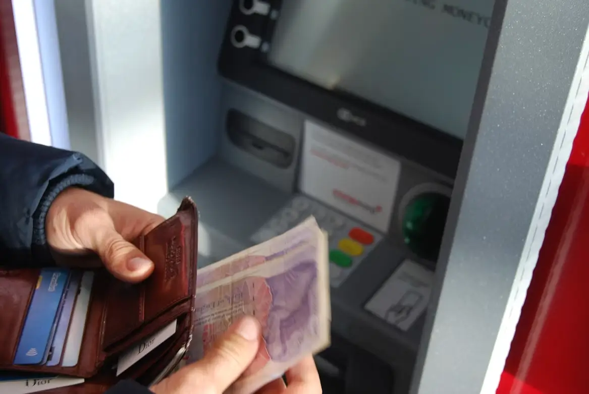
Offering both digital and traditional deposit methods helps suit customers’ preferences. Some people prefer cash, while others feel comfortable with digital wallets, direct bank transfers, and other modern payment methods.
Fostering competition among payment methods helps users choose their preferred option. They choose the easiest and fastest option, often the one they’re most familiar with.
Digital wallets have made online payments far more convenient for both users and service providers. On smartphones, transactions become even quicker because users need to enter nothing at all. In fact, all information is stored on the card or the device itself.
The best payment solution varies from customer to customer. Still, it is reasonable to say that it is the one they most commonly use in everyday life, for instance, when ordering food or shopping online. This information can serve platform owners as a strong foundation for developing payment systems so even a first-time user has an effortless deposit experience from the first moment.
Mobile Payment Pages Became Almost Mandatory

Image source: unsplash.com (https://unsplash.com/photos/woman-holding-android-smartphone-0IVop5v4MMU)
Entertainment through smartphones is steadily growing, which means payments must work on mobile screens.
It should be painless to understand the process and complete the transaction with minimal effort. Mobile users should avoid situations where they have to zoom in, scroll up or down like a book, or spend time searching for key areas.
Mobile payment flows should be based on touch interaction, the primary way users operate.
Good design typically uses deposit pages with a very limited set of buttons, short forms, a clear menu for selecting a payment method, and obvious deposit-confirmation messages.
What actually matters is simplicity. A player who signs up on a smartphone needs to switch from registration to their first deposit without feeling the payment process was designed primarily for desktop users.
Deposit Screens can Make all The Difference in Terms of Conversion
The first deposit page is a crucial part of the user experience, where the buyer is most likely to convert into a player. The decision to come to this point may stem mainly from a desire to explore the site further after initial research on another site.
Design plays a big role here.
A payment page that looks uncluttered and focuses on the next action will guide the user without distractions and help them move to the next step. Information on available payment methods, deposit amounts, offers, and related conditions will help the consumer make a final decision quickly and confidently.
For instance, deposit conversion rates can improve significantly by making the payment process easier and the flow as smooth as possible through clear instructions, fast loading, and a consistent look and feel. Also, keep the whole process under the same brand guidelines as the website or app to create the perception that users are on one platform.