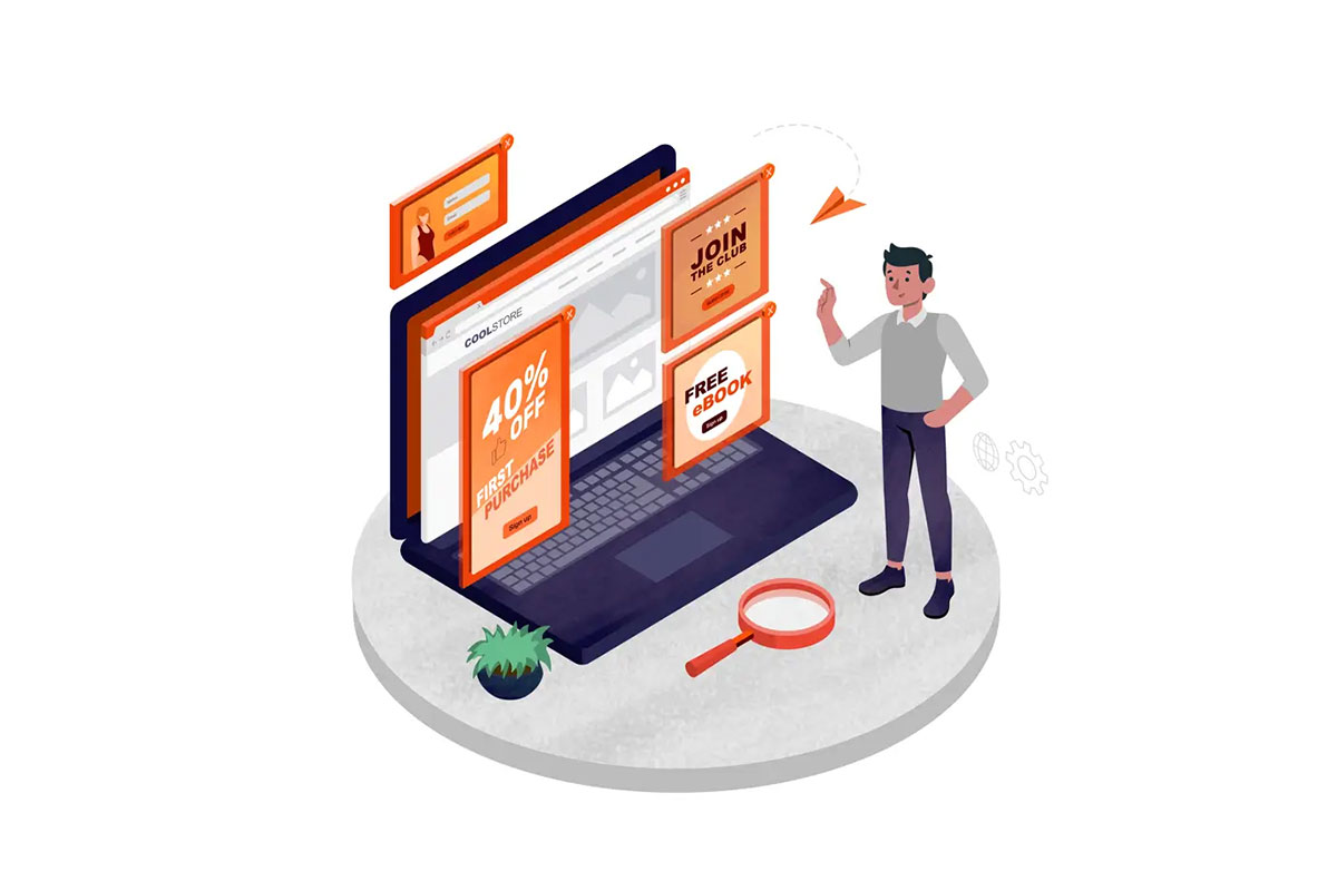
One of the most controversial topics in marketing is the use of popup notifications. Some claim they are the most annoying advertising techniques, while others recommend using them even in 2024. Your pop-up messages might not be as effective as you would expect because they are not done right. However, if all the aspects are considered and well-planned, you can boost user engagement and increase your site’s appeal. The latter is what we will focus on in this article.
A Mystery of Popup Messages: How Does It Work?
Popups are versatile marketing tools that are used for diverse purposes. The principle of their functionality is to appear on the platform at the appointed time and engage the user to take action.
If designed right, popups can be an integral part of the brand messaging as they are associated with the website. They are also part of the business messaging strategy as they display content aligning with the company’s style.
20 Newsletter Popup Examples (Email Subscription) | Sender

https://www.sender.net/blog/newsletter-popup-examples/
Popups and Website Visual Presentation: Useful Tips
Popup notifications are not separate from the website’s holistic design. One such message can reinforce your site’s visual side or fail in customers’ eyes. So whether you are using free popup templates or crafting these widgets from scratch, take advantage of these aspects that directly influence the website’s appearance.
Choose the Wording Carefully
Popup notifications don’t contain much written content, so you have to choose the wording wisely to prevent any uncertainties and inconsistencies. A great message on the popup will have the following characteristics:
- A well-defined advantage. Popup is the place to show the unique value of your offer to a customer. Be sure to define a clear benefit the user will receive by accepting it.
- A clear and attractive call-to-action (CTA). The most discouraging thing might happen when the client is ready to follow the popup but gets confused regarding the further steps. Your clear and concise CTA button should prevent such situations from occurring.
- A sense of urgency. Popup notifications are something special that can not be found just by browsing all the website content. To increase its value even more, create a sense of urgency. One of the ways to do this is to insert a countdown timer.
- A purchase motivator. Popups appearing when the user is about to leave the site have a special mission: to encourage visitors not to abandon the site without the purchase. Based on the customers’ interests, create an offer like free shipping, mentioning browsed products, or others to enhance the desire to buy.
Add Visual Content
Visuals help to process information faster. A scientific fact claims that the human brain processes images 60,000 times faster than text. And for popup notifications, time is of the essence. For a better connection with the viewer, consider adding these images:
- Images of social proof. Who would like to be assured that the service provides high-quality products? Your social proof images can speak for themselves.
- Images of the products. Instead of writing hundreds of words, just add a photo. It will work more efficiently than any product description.
- Images of team members. In the digitalized world, people value human connection. Posting about your team can create that precious connection.
Add Interaction
Interactive content helps to create a memorable and engaging user experience. And popup notifications are the right place to add that note of interactiveness. Marketers actively use gamification to turn the usual browsing experience into an exciting journey. In this way, even ordinary online shopping can be engaging. Here are some more ideas for turning popups into interactive notifications:
- popups with interactive videos;
- popups with guided selling;
- popups with interactive flipbooks;
- popups with puzzles and quizzes;
- popups with interactive conversation.
How to Make a Popup Fit a Website’s Design
It is crucial to make the widgets an integral part of the website to create a smooth user experience for customers who will engage with your popup notifications. The first thing to consider is the color palette. The popup message should be designed in the same color scheme as the whole website.
Further, typography also matters. The text formatting on the popup notification and the website content should be the same.
The tone of voice is not easy to identify but is important to follow. Consistency is the key to success in messaging since the brand’s messages are sent via different channels.
Last but not least is the layout. The popup might be appealing, but the image will not attract users if it doesn’t harmoniously fit the design.
To Sum Up
A popup notification is a universal marketing instrument that not only intends to attract more customers but also enhances the appeal of the website. These widgets can harmoniously complement the existing site’s design if created according to specific criteria. For those who want to see how popups can fit their brand, experiment and use free popup templates.


